Yesterday I attended User Interfaces for Physical Spaces, a one-day workshop and field trip co-produced by MAYA Design and the IA Institute. The day was essentially an extended case study of the work MAYA did with the Carnegie Library of Pittsburgh (the public library system, CLP), applying methods of user-centered design and information architecture to the design of physical spaces.
The story of how the project landed at MAYA was illuminating. The CLP planned for major architectural renovations to their main library and branches. They sent out an RFP to a number of architecture firms. They awarded the project to EDGE design, because their proposal included their stories of trying to *use* the library (and struggling). EDGE developed a vision for a modern library, including information displays and kiosks. MAYA was originally brought in to help with the interactive portions of the system, but when they asked EDGE and the CLP what went on the kiosks, no one had a good answer. MAYA realized they needed to step back and truly appreciate the space.
In MAYA’s Office
The bulk of the workshop took place in MAYA’s offices, where we walked through the development of their designs.
MAYA’s first project was a 6-week-long intervention, with discussions with key CLP staff, guerrilla on-site research, development of key personas of library users, scenarios of use, and the development of a framework for understanding the entire system of use.
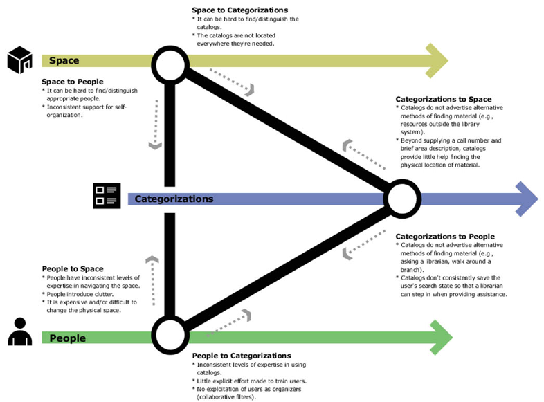
With their scenarios, they identified four components in this process: Users (1) go through Organizers (2) to get Materials/Activities (3) in order to Use/Participate (4).
This is a pretty standard process for smart user-centered design, but there was a key point of differentiation from screen-based work. It comes with what MAYA calls Organizers. MAYA identified three classes of organizers — Library Staff, the Physical Space, and the Categorizations in the catalog system.
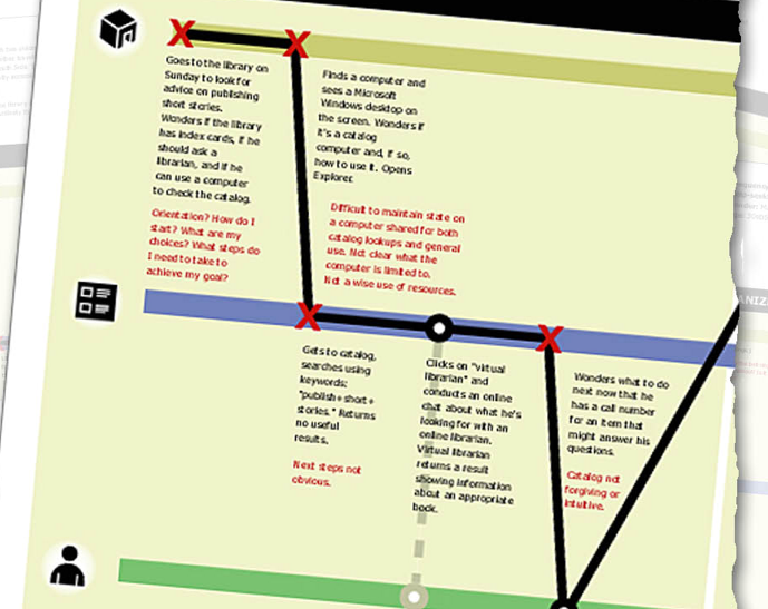
MAYA developed scenarios of use for their four key personas, and through that identified breakpoints — moments where a person’s attempt at getting something done is stopped by some problem they run into.

Initial attempts at diagramming the scenarios linearly went nowhere, but thinking through the problem, they realized the breakpoints mapped to the organizers — things broke down when switching from people to categorizations, or from the categorizations to the space.

Click to enlarge
The A-ha! moment for them came in this distinguishing these organizers, because it led to the development of a framework that allowed them to get their head around the problem. The realized that the primary problems people had in using the library occurred when people switched from organizer to organizer — from using the online catalog to engaging with the space, or from talking to a librarian to using the catalog.
This also served as an A-ha! For the CLP. Up to this point, MAYA was essentially telling them what they already knew — there was a myriad of problems people face when using the libraries. The framework allowed the CLP to better understand the problem space.
So, unlike screen-based work, where we tend to get caught up in breakpoints with a single “organizer” — the software — MAYA had to grapple with three potential points of failure. This is orders of magnitude more complex.

Click to make bigger
This triangle shows what needs to be considered when handing off from organizer to organizer before the breakpoints occur — and to smooth those handoffs by being aware of the issues that arise when making those leaps.
The 6 week project ended with “Tiger Teams” of 4 or 5 folks — designers and CLP staff — rapidly prototyping solutions to accommodate this new understanding. These blue sky propositions were meant to encapsulate the research in an explicit fashion — not just giving the CLP a bunch of documents with models on them, but ideas for the implications of these findings on design.
After the 6 week project ended, the CLP asked MAYA to help develop an actual solution for the library. This involved, essentially, in developing an information architecture that tied together the three organizers. They overlaid this information architecture on the physical architecture, by annotating actual building blueprints. They spent a lot of time refining nomenclature for wayfinding (thus arriving at “Ask A Librarian” instead of “Reference Desk” or “Customer Services” instead of “Circulation Desk”), and they worked closely with Landesberg Design to develop a signage system that communicated this information architecture clearly.
Field Trip!
After walking through MAYA’s process, we then boarded a chartered school bus (really! yellow on the outside! green canvas seats!), and headed to some renovated libraries. The first library was the Squirrel Hill branch.
![]()
This library demonstrated just how well the system worked. Clear, simple signage illuminated what you could do. Signposts guided you as to where to go. What was amazing was how well it all just worked — if we hadn’t spent the last 6 hours being prepped for this experience, I don’t know how many of us would have realized what had gone into the design of this space, because it just felt right.

Squirrel Hill residents, though, know just how difficult the old library was, and dearly love their new space. It’s clearly become a true community center — people hanging out, reading, surfing the internet (free wi-fi!), and connecting with one another.

Photo by James Melzer
The second library we visited was the Main Library. This library has a host of complications, the biggest of which is that it’s in an 1895 building on the register of historic places. This meant that it’s boxy, room-to-room-to-room layout couldn’t be changed.
Still, the Main library had some important successes. The Cafe is extremely popular, and its yellow floor has become a point of reference for wayfinding.

They’ve also been able to incorporate much of the signage and language that worked so well in Squirrel Hill.
The Main Library also demonstrates what happens when there is too much architect-intervention. Each library is modified by a different architect. At Squirrel Hill, the architect was content to pretty much follow the plan, and create an inviting, open space that just worked. At the Main, the architect did very well to open up and brighten the space, but often missed the point when it came to wayfinding.

Whereas the wayfinding system designed for the libraries involved white type on black, at the Main, they used the more traditional black type on white. Unfortunately, white is everywhere (all walls were wisely painted white to improve the lighting), and that means the signs get lost in the sea of white.
Also, the architects seemed to have a fetish for glass panels. Glass walls are everywhere in the new library, whether it makes sense or not. Perhaps the most egregious case is above the librarian desk near the entrance. While you can see the “ask a librarian” sign if you’re staring at it straight on:

…when you shift your angle, it pretty much disappears:

It’s fascinating to me the way that designers simply won’t leave well enough alone. Actually, well make well enough worse by fiddling with it.
Well, this was a great event, and a huge thanks to MAYA for opening their doors, and the work, up to others.